J.Gong
2025-08-18
1.74min
How the Blog Cards Were Made 🎨✨
My website is basically my personal playground 😎. In this rebuild, I decided to put extra love into the blog card design.
Years ago I rebuilt the site from Gatsby to Astro, I wanted a masonry-style blog list. Pretty soon I realized: if you want a masonry layout, it needs color. Imagine Pinterest without images – chaos! 😅
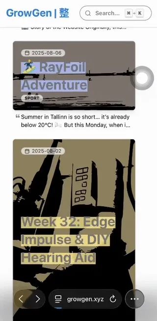
SVG Backgrounds 🖼️
I now have almost 800 blogs. Giving every post a cover image? Nope. Some posts just don’t need it. Cover images also eat up storage and slow down the page.
So, I tried color blocks… still too pale 😬. Finally, SVGs saved the day! They’re small, scalable, and super flexible.
SVG Backgrounds has tons of free SVGs. Pair them with CSS mix-blend-mode and boom 💥 – your title pops off the background.
Cover Backgrounds 📸
Some posts do have images. But using SVGs as placeholders and then loading images causes a blink – annoying! And mix-blend-mode can get messy on complex pics.
Here’s the game plan:
- Pick the dominant color of the image → placeholder color
- Pick a bright contrasting color → for title highlights
- Trace the image into SVG → placeholder
Finding the Colors 🎨
I use node-vibrant to extract a color palette from each image.
Then, to make it play nice with Mantine UI, I find the closest Mantine color using chroma.js. The deltaE function helps me calculate the difference (0 = perfect match, 100 = super different).
Tracing the SVG 🖌️
For SVG placeholders, I use potrace to trace edges from images.
At first, the SVGs were huge 😅. Tweaking parameters solved that.
{
    turdSize: 100,
    optCurve: true,
    optTolerance: 0.4,
}
Also, since not all images are in the right format, I use sharp to convert them to PNG before tracing.
Title Highlights ✏️
I wanted a marker-style highlight instead of a boring background.
Found a slick effect at Free Frontend: using linear-gradient + background-size for a slim highlight – looks like someone really went over the text with a pen 🖍️.
Lazy Loading Images ⏱️
Classic SSR problem: images blocking content. Always load images after content. In React, that’s useEffect. Your users will thank you 🙏.
Card Layouts 📐
Masonry can still feel messy with different box heights. I used:
aspect-ratio→ 5 sizes of boxesoverflow: clip→ ensures extra content doesn’t break the layout
How to pick the box size? Count the words! 📝
Intl.Segmenter('en', { granularity: 'word' }) works for multiple languages, including Chinese.
- More words + more tags = bigger box
- Fewer words + fewer tags = smaller box
What’s Next 🤔
I’m hitting pause on these cards for now, but the story isn’t over.
- Still want to tilt multi-line titles for a poster vibe 🎭
- Currently, Astro backend handles the SVGs/colors → could be better in a remark plugin so everything’s ready at markdown parsing, In fact, I triggered a performance problem once, which caused about 1 hour of building time 😅.
Stay tuned – these blog cards might get even snazzier soon! 🚀
Headings